To optimize your presentation for viewing on a mobile phone, you should ensure its definition includes a Mobile device type with content, formatting, and layout that is appropriate for a mobile device. Thanks to Pyramid's responsive presentation design, the Mobile device type layout is selected automatically when a user opens the presentation at runtime from their mobile device.
Note: If your presentation does not include a Mobile device type, then only the visuals included in the presentation are shown when the presentation is viewed on a phone.
Device types and "responsive" design
Pyramid's responsive presentation design ensures that presentations are always loaded in the format appropriate for the device used to access them. Whether or not a presentation has been optimized for the current device type, it will automatically be opened in the format that is appropriate for the current device. This means viewing a presentation from a mobile phone will either open just the visuals from the presentation (where there is no Mobile device type layout defined) or will open a presentation whose content and layout is optimized for display on a mobile as part of the presentation.
- Click here for more information about Device Types and Responsive Design
Presentations for Mobile device types
You can create a presentation that is optimized for Mobile device types in Present Pro:
- By creating a New Presentation with the Mobile device type.
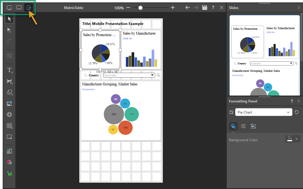
- By clicking the Mobile device type icon (orange arrow below) in your existing presentation, thereby creating a new Mobile device type layout inside your existing presentation.
Note: Presentations for mobiles must be built using the desktop or tablet application; they cannot be built using the mobile phone app.
Optimized presentations for Mobiles
Presentations that are optimized for the Mobile device type have the following features:
- A fixed canvas width. Presentations for Mobile device types cannot be re-sized horizontally.
- A tiled, rather than a fixed, layout. This means that any content dropped onto the presentation snaps to the tile lines. For information about configuring the tile lines, see Layout Grid.
- Only one "slide," which extends in length (re-sizing vertically) as you add content items to it.
Converted content
When you add a layout for the Mobile device type to a pre-existing presentation, you are prompted to Convert the initial content associated with one of the other device types. If you select one of these conversion options, the visuals from the existing layout are copied into the new layout. Other assets, including buttons, text, slicers, and images (everything except visuals), are not copied across and must be added manually if needed.
Miniature visuals
Miniature visuals are created automatically when you scale a visual down to a size that makes its content illegible. These tiles typically display the measure as a number with its name underneath:
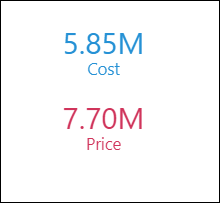
Note: The purpose of a miniature visual is to provide a way to easily view and interpret important data at a glance, even where there is a lot of information and limited space.
When adding visuals to a presentation for Mobile device types, the visual typically fills the width of the canvas:
- Matrix grids are always displayed as Miniature Visuals.
- Other visual types are only shown as Miniature Visuals if you shrink their default width to around half of the available space.
Tip: When you view the presentation at runtime, you can click on the miniature visual to open the full visual.
Layout Grid
The layout grid helps you to arrange content items on your canvas, allowing you to easily create a presentation with a professional look-and-feel. You can use the Layout Grid option on the Presentation ribbon to change the number of columns in your layout grid, increasing the control you have over the layout of your content items.
Note: The Layout Grid option is only available where the device type for your presentation is Mobile.
From the Presentation ribbon:
- Open the Layout Grid dropdown list and select the number of columns you would like to include horizontally across the canvas:
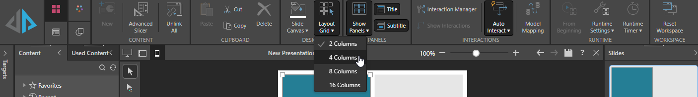
By default, your canvas is created with two columns. If you change this to four columns, the number of tiles increases to four horizontally.
Changing the number of columns may affect your existing items and will affect any new items you add to your canvas.
Adding New Items
When you add new items to your canvas, the default sizes and positions of your new shapes, text boxes, and so on are determined by the new grid. For example, when you click the canvas to add a shape, the new shape typically defaults to one or two columns wide and "snaps" to the column closest to your drop location.
Updating Existing Items
When you have existing items (shapes, text boxes, visuals) already on your canvas and then you change the grid size, Pyramid tries to retain a similar layout while snapping the existing items to the new grid lines. This may mean the size and position of some items change to fit into the new grid.
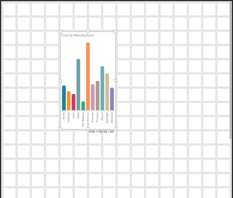
 Example: Snapping and Redrawing
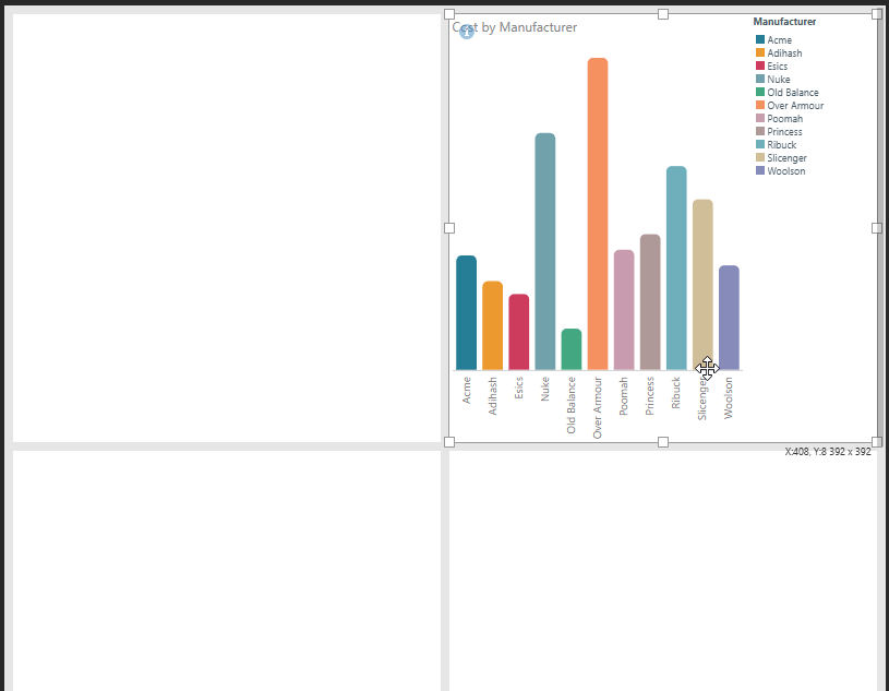
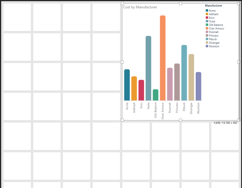
Given a 16-column grid and a visual that has been manually re-sized to 4 x 7 cells and positioned close to the center of the canvas:
When you change the Layout Grid from 16 to two columns, Pyramid attempts to retain the visual's original size and location while also snapping to the new grid. This puts the visual in the second column (since the original is halfway across the canvas and now there are only two tiles) and increases the visual's width to fill the cell:
Changing the Layout Grid again, this time from two to eight columns, does not have a similar effect on the visual. This is because: 1) there is no memory of the initial size and shape of the visual, it is the visual from the last step that we are snapping to the new grid, 2) the visual can continue to snap to the new grid while retaining its position and size from the last step:
Note: If you had changed from the original visual in this example (4 x 7 cells on a 16-column grid) to the eight-column canvas without the intermediate step, your visual would remain more similar to the original size and position.
Viewing your Mobile Presentation
As you create your presentation, it is important to view it regularly at runtime to ensure that its content is as expected.
- Click here for more information about Mobile presentations at runtime